Summary:
The biggest trend this year centers around what major paint companies are calling “naturally refined” palettes. These aren’t your stark, clinical whites or bold statement walls from years past.
Instead, think sophisticated neutrals with subtle depth—colors that feel grounded and calming without putting you to sleep. These palettes work especially well in Michigan homes because they complement our natural landscape while providing the warmth you crave during long winters.
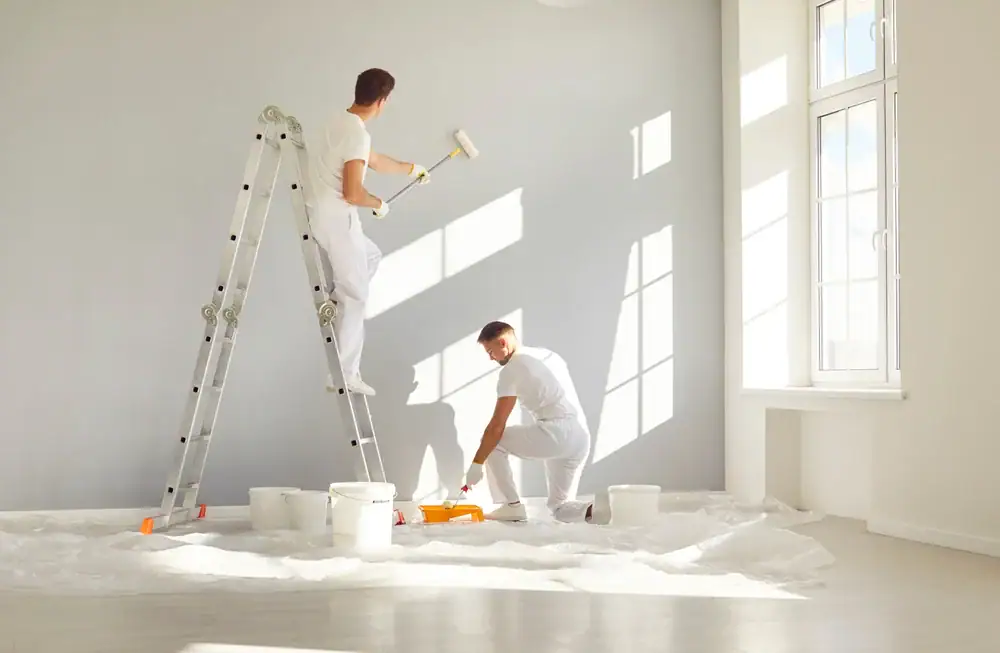
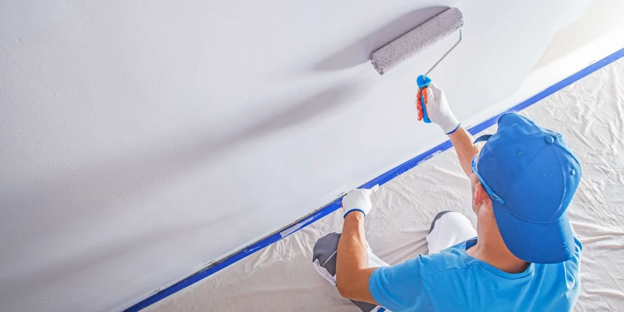
For painting contractors in Macomb County, MI, these colors represent a smart investment because they photograph beautifully and work with virtually any decor style you might change over time.
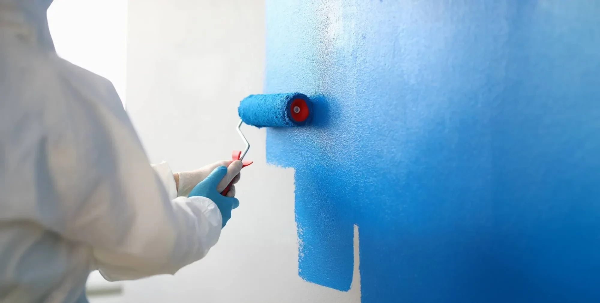
The standout color everyone’s talking about is Quietude—a soft sage with whisper-blue undertones that works beautifully both inside and out. This isn’t your grandmother’s mint green; it’s more sophisticated and versatile than anything we’ve seen in residential painting recently.
What makes this shade so appealing is its ability to feel both calming and energizing. In your living room, it creates a serene backdrop that makes furniture pop. In a bedroom, it promotes relaxation without feeling cold or sterile like some of those trendy grays we’ve been seeing everywhere.
The blue undertones prevent it from looking too yellow or muddy, which can happen with some greens in Michigan’s varying light conditions. We’re seeing huge demand for this type of complex neutral because it photographs beautifully and works with virtually any decor style.
For homeowners in Oakland County, MI, this trend is particularly relevant because these colors complement the area’s natural beauty while providing the sophistication that matches the region’s architectural styles. The key is choosing the right finish—eggshell or satin works best for walls, while semi-gloss is perfect for trim work that needs to withstand Michigan’s humidity changes.
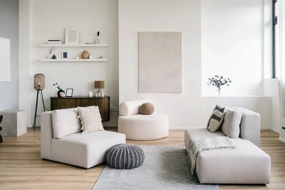
After years of cool grays dominating every room, 2025 marks a definitive shift toward warmer neutrals. Think creamy whites, soft beiges, and taupe tones that actually feel inviting rather than sterile—exactly what you need after a long Michigan winter.
This change isn’t just about aesthetics—it’s about creating spaces that feel more human and comfortable. Cool grays, while trendy, often made rooms feel cold and uninviting, especially during our long winters. Warm neutrals solve this problem by adding subtle richness without overwhelming your space.
Benjamin Moore’s Cinnamon Slate exemplifies this trend perfectly. It’s a complex neutral that reads differently throughout the day, appearing warmer in morning light and more sophisticated in evening lamplight. This adaptability makes it perfect for open floor plans where natural light changes dramatically throughout the day.
The practical benefits are significant too. Warm neutrals are more forgiving with furniture and decor choices, making them ideal if you like to change accessories seasonally. They also tend to age better than stark whites, which can start looking dingy over time—especially important in Michigan where winter tracked-in salt and dirt can be hard on paint.
For families in Macomb County, MI, these colors create a welcoming atmosphere that works year-round, complementing both summer’s bright light and winter’s cozier indoor lighting.
Want live answers?
Connect with a Legends Painting expert for fast, friendly support.
While naturals dominate, bold colors are making a carefully planned return—but not in the way you might expect. Instead of painting entire rooms in dramatic hues, smart homeowners are using bold colors strategically for maximum impact.
This approach gives you the personality and energy of bold color without the commitment or overwhelm. Think rich jewel tones on a single accent wall, or dramatic navy in a powder room where you can be adventurous without affecting your daily life.
The key difference from previous bold color trends is restraint and intentionality. Every bold choice serves a purpose and balances with the rest of your home’s palette.
Navy blues and forest greens are having a major moment, especially in spaces where you want to create intimacy and sophistication. These aren’t the bright, primary colors of the past—they’re complex, nuanced shades that feel both classic and contemporary.
Deep blues work particularly well in dining rooms and home offices, where you want to create focus and calm energy. The richness adds depth without being distracting, and these colors photograph beautifully for those who share their spaces on social media.
Forest greens bring the outdoors in, which resonates with Michigan homeowners who appreciate our natural landscape. In a study or library, these colors create a cocoon-like feeling that encourages relaxation and concentration.
The trick with these bold colors is understanding undertones. A navy with purple undertones feels different than one with green undertones, and the wrong choice can clash with your existing furnishings or lighting. We understand these nuances and can help you choose shades that work harmoniously with your home’s specific conditions.
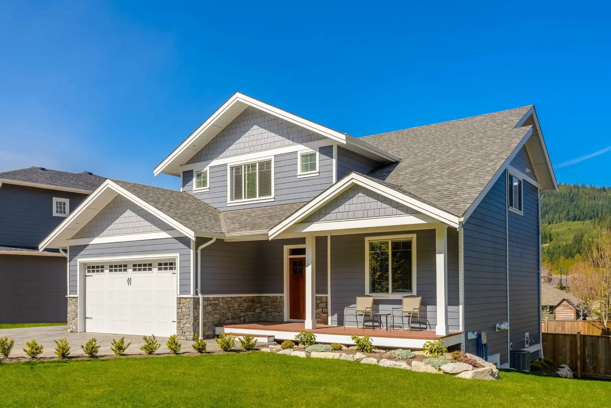
For exteriors, these colors are particularly striking on Victorian or craftsman-style homes common in Oakland County, MI, where architectural details can handle and showcase the richness. Just remember that Michigan’s harsh winters and intense summer sun require high-quality exterior paint to maintain these dramatic colors over time.
Emerald greens, sapphire blues, and amethyst purples are making sophisticated appearances as accent colors throughout the home. These aren’t overwhelming applications—think a jewel-toned island in an otherwise neutral kitchen, or a rich emerald in a guest bathroom.
The beauty of this trend lies in its flexibility. You can experiment with bold color in small doses, and if you tire of it, changing an accent wall is much easier than repainting an entire room. This approach also allows you to incorporate seasonal changes more easily—something Michigan homeowners particularly appreciate.
These colors work particularly well in Michigan homes because they complement our seasonal changes. Rich emerald feels fresh in spring and summer, while deeper sapphire tones feel cozy during fall and winter months.
The key to success with jewel tones is balance. They need plenty of neutral space around them to breathe, and they work best when they echo colors found in your artwork, textiles, or natural surroundings. We can help you determine the right proportion and placement to achieve the impact you want without overwhelming your space.
For homeowners considering resale value, jewel tone accents offer personality without alienating potential buyers. They’re bold enough to feel current but classic enough to have staying power—exactly what you want in a competitive real estate market like Macomb and Oakland Counties.
The best painting trends are the ones that work with your lifestyle, your home’s architecture, and Michigan’s unique climate conditions. Whether you’re drawn to the serene sophistication of naturally refined palettes or the strategic drama of bold accent colors, the key is choosing colors that you’ll love living with long-term.
Remember that trends should inspire, not dictate your choices. The most successful home transformations happen when current trends meet personal style and practical needs—especially important when you’re dealing with Michigan’s weather extremes that can affect how colors look and perform over time.
If you’re ready to bring these 2025 trends into your Macomb County, MI or Oakland County, MI home, we at Legends Construction LLC can help you navigate the options and achieve professional results that will look beautiful for years to come.
Article details:
Continue learning:
Company
Support
Useful Links