Summary:
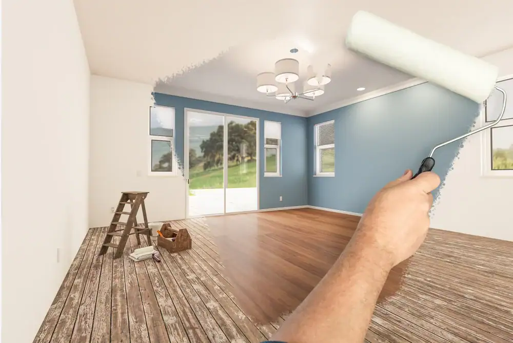
White walls had their moment. For years, they were the default—the safe choice that worked with everything and offended no one. But walk into any freshly painted home in Macomb County, MI or Oakland County, MI right now, and you’ll see something different. Color is back. Not the chaotic, overwhelming color of decades past, but bold, intentional shades that feel earthy and modern. The residential interior painting trends dominating 2026 aren’t about following what’s trendy—they’re about creating spaces that actually feel like home. If you’ve been thinking about a refresh, this is the year to explore what the right paint color can do for your space.
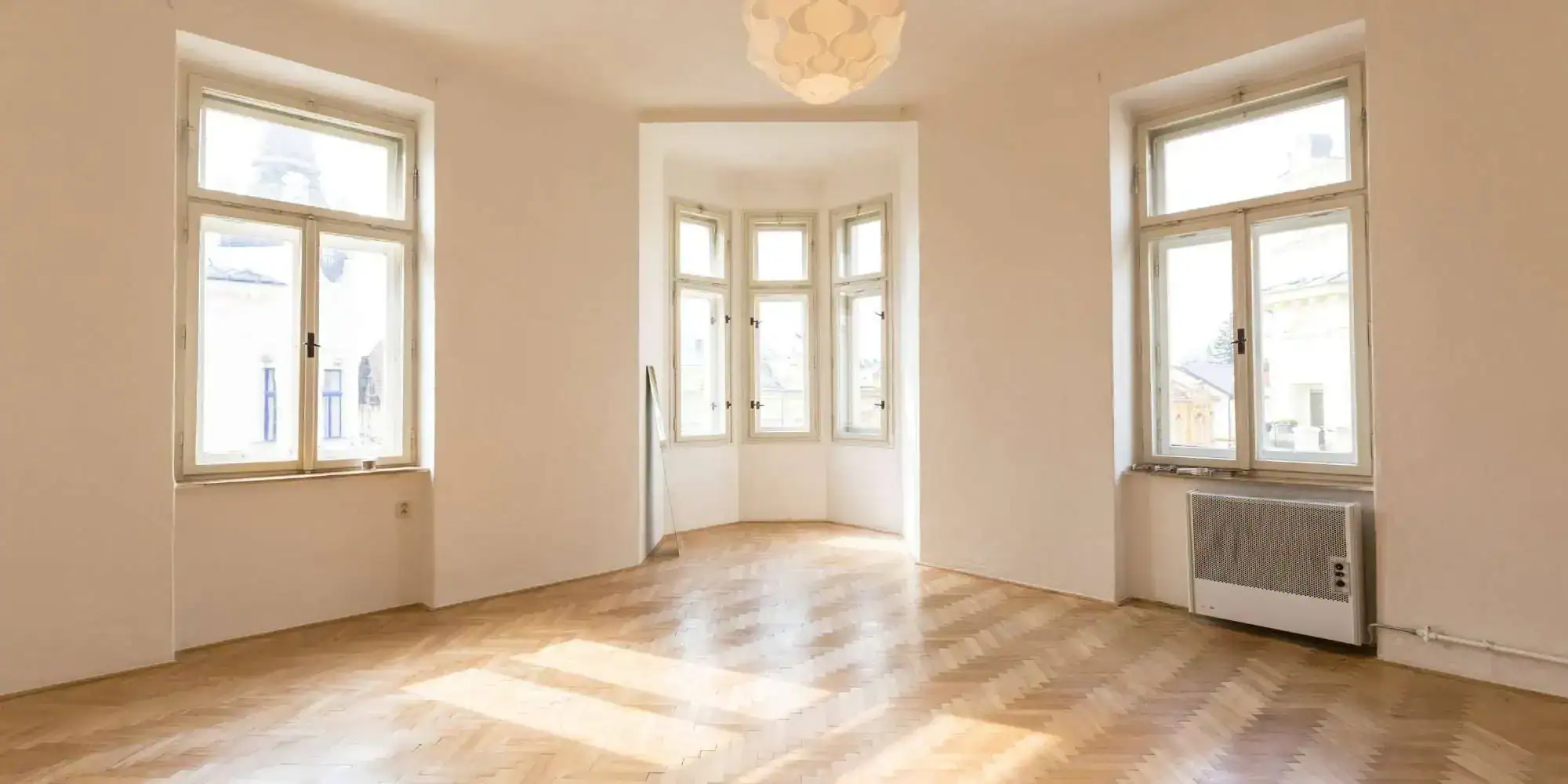
The all-white interior had its run. It felt clean and modern for a while. Then every home started looking the same—like a staged listing with zero personality.
People got tired of it. Homeowners want spaces that feel personal, warm, and lived-in. That’s what’s driving the shift in residential painting right now. Instead of stark whites and cool grays, the 2026 palette leans into nature-inspired tones that feel grounded. Muted greens. Warm terracottas. Rich olives. Sandy neutrals that bring the outdoors in without looking like a log cabin.
This isn’t about chasing trends. It’s about creating spaces that feel good to be in. And in Michigan, where winters are long and natural light is limited, the right paint color makes a bigger difference than most people realize.
If one color family defines 2026, it’s green. Not bright, grassy green—muted, sophisticated shades like sage, olive, eucalyptus, and dusty mint that feel calming without demanding attention.
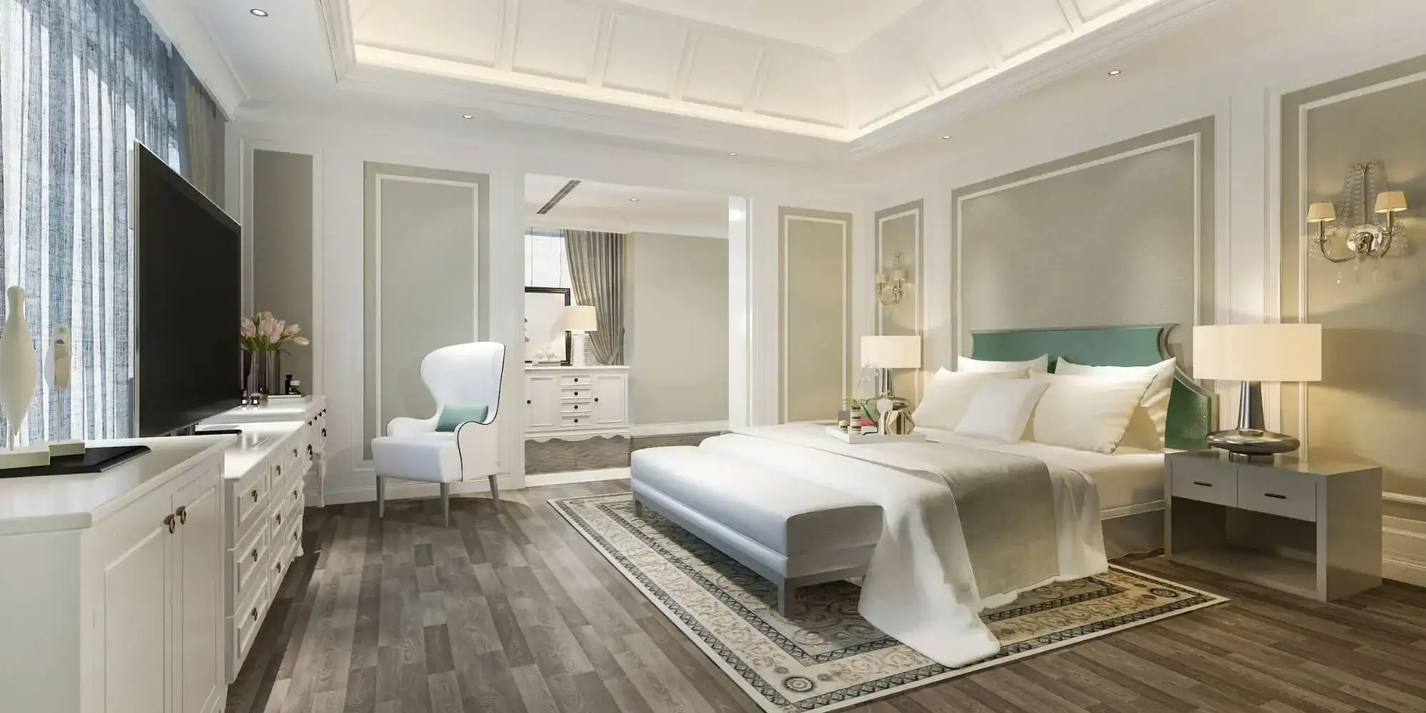
These colors work because they’re neutral enough to live with long-term but interesting enough to make a statement. Pair them with natural wood, white oak floors, or brass fixtures, and you’ve got a look that feels both current and timeless. They’re especially popular in living rooms, bedrooms, and home offices where you want a restorative vibe instead of a sterile one.
Earthy tones are also dominating residential painting projects across Macomb County, MI and Oakland County, MI. Warm terracottas, clay-inspired beiges, and sandy taupes are replacing the cool grays that ruled the last decade. These colors bring warmth without feeling dated, and they flow beautifully in open-concept spaces where you need cohesion from room to room.
Here’s what most homeowners don’t realize: these deeper, richer colors demand better surface prep than white ever did. Any wall imperfection—nail holes, cracks, uneven texture—shows up more with muted greens or terracottas. That means thorough cleaning, patching, sanding, and priming before the first coat goes on. Skip those steps, and your paint job will look DIY instead of professional. If you’re not confident in your prep work, hiring a painter who knows how to handle bold colors is the difference between results you love and results you regret.
Greens are leading, but blues haven’t disappeared—they’ve evolved. The pale, washed-out blues are out. Deep teals, smoky jades, and rich navy tones are in, adding drama without feeling heavy.
Teal sits right between blue and green, offering the best of both worlds. It feels calming like blue but grounded like green. Muted teals with gray undertones are especially versatile—they layer well with other colors and feel sophisticated instead of bold.
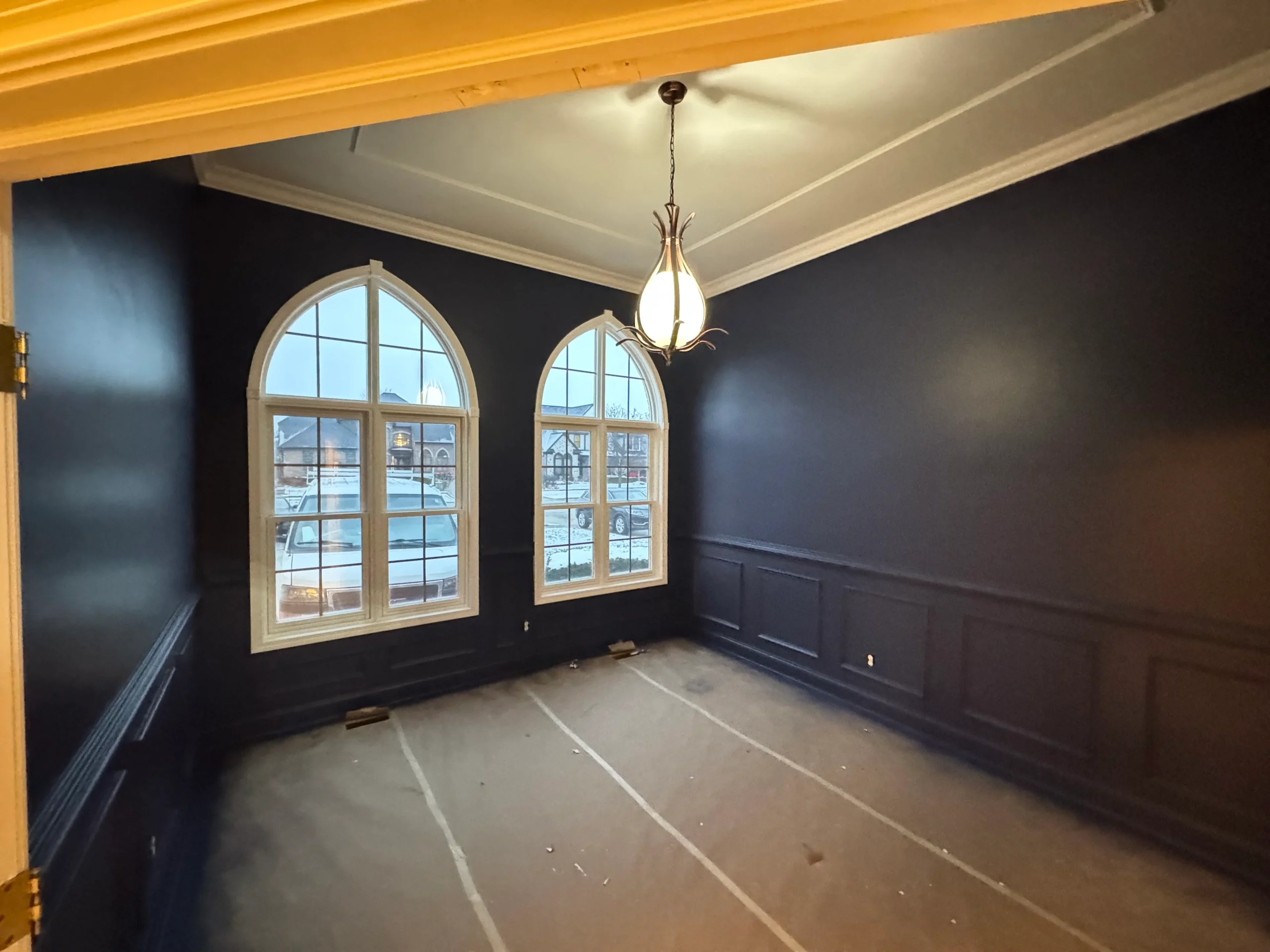
Deep blues like navy are making statements in dining rooms, home offices, and accent walls. These colors create intimacy and sophistication, but they need thoughtful lighting to avoid feeling too dark. Pair them with warm wood tones, brass or bronze hardware, and layered lighting, and you get a space that feels elevated and intentional.
One mistake homeowners make with bold blues: choosing them impulsively. A color that looks stunning on a small swatch can feel completely different when it covers four walls. The lighting in your home—natural light, overhead fixtures, lamps—changes how the color reads throughout the day. What looks moody and sophisticated at night might feel too dark and cold in the morning.
If you’re considering a bold blue or teal for your residential painting project, start small. Try it in a powder room, laundry room, or on one accent wall before committing to an entire space. These smaller areas let you see how the color feels in your home without the pressure of a full repaint if it doesn’t work.
Want live answers?
Connect with a Legends Painting expert for fast, friendly support.
Choosing a paint color is harder than it should be. You’re staring at hundreds of swatches, and they all look the same. Or you pick one that looks perfect in the store, only to realize it clashes with your floors, your furniture, or the way light hits the room.
Here’s the truth: color doesn’t exist in a vacuum. The same shade of green looks completely different in a north-facing room versus a south-facing one. It looks different next to oak floors versus gray tile. And it looks different under warm lighting versus cool lighting. That’s why you can’t pick a color based on a tiny swatch—you have to see it in your actual space.
Start by considering the room’s purpose. Bedrooms and living rooms benefit from calming colors like muted greens or soft teals. Kitchens and dining areas can handle warmer, more energetic tones like terracotta or warm beige. Home offices do well with grounded colors that help you focus without feeling sterile—olive greens or deep charcoals work beautifully.
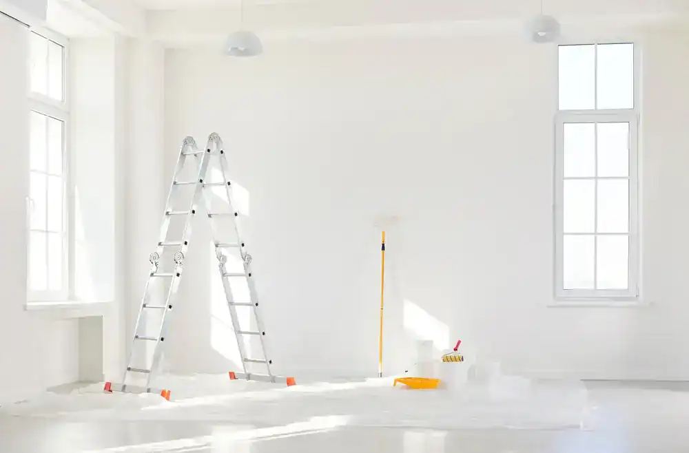
Here’s the process that actually works: buy sample pots of your top two or three colors. Paint large swatches directly on your walls—not on poster board, not on cardboard, but on the actual wall. Make them big, at least two feet by two feet, so you get a real sense of the color.
Live with those samples for a few days. Look at them in the morning when natural light floods the room. Check them in the afternoon when the sun shifts. See how they look at night under your lamps and overhead lighting. This is the only way to know if a color will actually work in your space.
Pay attention to how the color interacts with your existing elements. Does it complement your flooring, or does it clash? Does it make your furniture look dingy, or does it bring out the best in your pieces? These are questions you can only answer by seeing the color in context.
Also consider the room’s orientation. North-facing rooms get cooler, indirect light, which can make colors feel more muted and sometimes colder. South-facing rooms get warm, direct sunlight, which can intensify colors. East-facing rooms get bright morning light. West-facing rooms get warm afternoon and evening light. All of this affects how your residential painting project will look throughout the day.
If you’re painting an open-concept space, the challenge is even bigger. You need colors that flow from one area to the next without feeling disjointed. That doesn’t mean everything has to match, but the colors should share similar undertones—either all warm or all cool. Mixing a warm beige in the kitchen with a cool gray in the living room creates a visual clash that’s hard to ignore.
Not all painters understand color. Some can execute the technical work—prep, prime, paint—but don’t have the experience to guide you on color choices. Others have been doing residential painting long enough to know what works and what doesn’t, and they can save you from expensive mistakes.
A good painter asks about your lighting, your existing finishes, and how you use the space. They recommend testing samples and don’t rush you into a decision. They’re also honest if a color you love isn’t going to work—not because they’re trying to control your choices, but because they’ve seen what happens when homeowners ignore lighting and undertones.
Prep work matters even more with bold colors. Any wall imperfection shows up more prominently with deep teals, rich olives, or warm terracottas than with white. That means thorough surface preparation isn’t optional—it’s required. Your painter should be cleaning, patching, sanding, and priming every surface before the first coat goes on.
Application technique also matters. Bold colors often need multiple coats for even coverage. The difference between a streaky, uneven finish and a smooth, professional one comes down to skill and patience. A painter who rushes or cuts corners leaves you with results that look DIY, not professional.
Ask potential painters about their experience with bold colors. Have they worked with deep teals, muted greens, or rich terracottas? Can they show examples of past residential painting projects? Do they understand how lighting affects color? These questions separate painters who just apply paint from painters who understand color and deliver results you’ll love.
Make sure your painter uses high-quality paint. Cheap paint might save money upfront, but it won’t cover as well, won’t last as long, and won’t give you the rich, saturated color you’re expecting. Premium paints from Benjamin Moore or Sherwin-Williams make a noticeable difference, especially with bold colors in residential painting.
The shift away from white walls isn’t a fleeting trend. It reflects how people want to live—in spaces that feel warm, personal, and grounded. Whether you’re drawn to muted greens, earthy terracottas, or deep teals, the key is choosing colors that work with your space, your lighting, and your lifestyle.
Don’t rush the decision. Test samples, live with them, and pay attention to how they make you feel. When you’re ready to move forward, work with a painter who understands that residential painting is more than applying a coat of color—it’s the foundation of how your home feels.
If you’re in Macomb County, MI or Oakland County, MI and ready to explore what bold color can do for your space, we bring over 10 years of painting experience with a focus on quality work and competitive pricing. We’ll help you choose colors that work and execute the job right the first time.
Article details:
Continue learning: