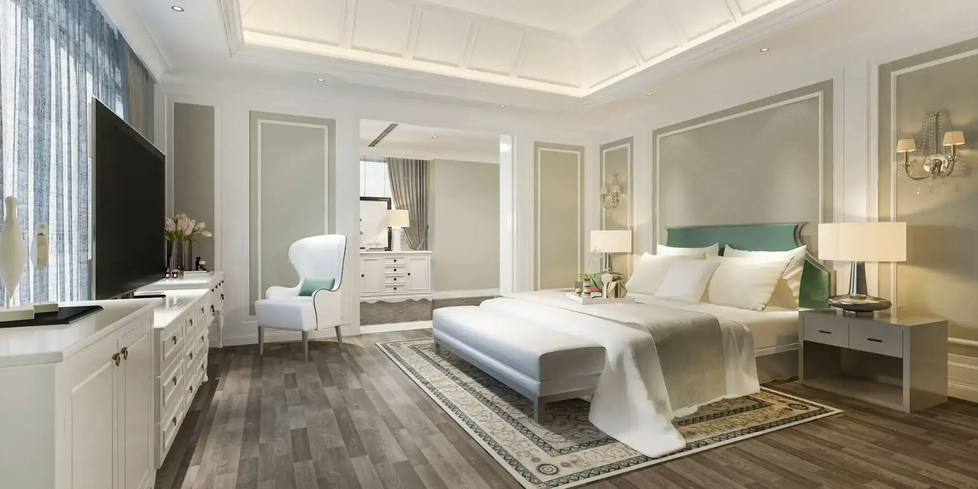
Choosing interior paint colors doesn't have to be overwhelming. Learn the five designer secrets that help Macomb and Oakland County homeowners select colors they'll love for years.
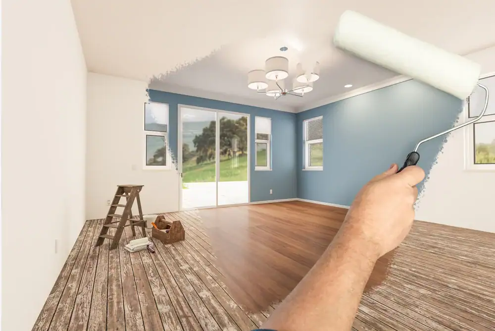
Summary:
You’ve been staring at paint swatches for an hour. Every beige looks identical under the store’s fluorescent lights, and you’re no closer to a decision than when you walked in.
You know this color will cover your walls for the next several years, so the pressure to get it right feels heavy. One wrong choice means living with a color you hate—or spending more money to repaint.
Choosing interior paint colors for your residential interior painting project doesn’t have to feel this overwhelming. We use specific strategies to narrow down thousands of options and land on colors that work beautifully in real homes. These aren’t complicated formulas or expensive tools. They’re practical approaches that account for how you actually live in your space, how light moves through your rooms, and what already exists in your home.
Most people approach color selection backward. They pick a color first, then try to make everything else work around it. This creates problems you won’t notice until the paint is already dry.
Your home already has fixed elements that aren’t changing—flooring, countertops, brick fireplaces, wood trim. These permanent features have undertones, and your paint needs to complement them, not fight them.
If your kitchen countertop has warm peachy undertones and you paint the walls a cool gray with blue undertones, the clash will bother you every single day. Start by identifying what’s staying. Look at your floors in natural light. Notice the undertones in your tile or stone. Pay attention to the wood tones in your cabinets or trim. These elements will guide which color families actually work in your space versus which ones will create visual tension you can’t quite explain but definitely feel.
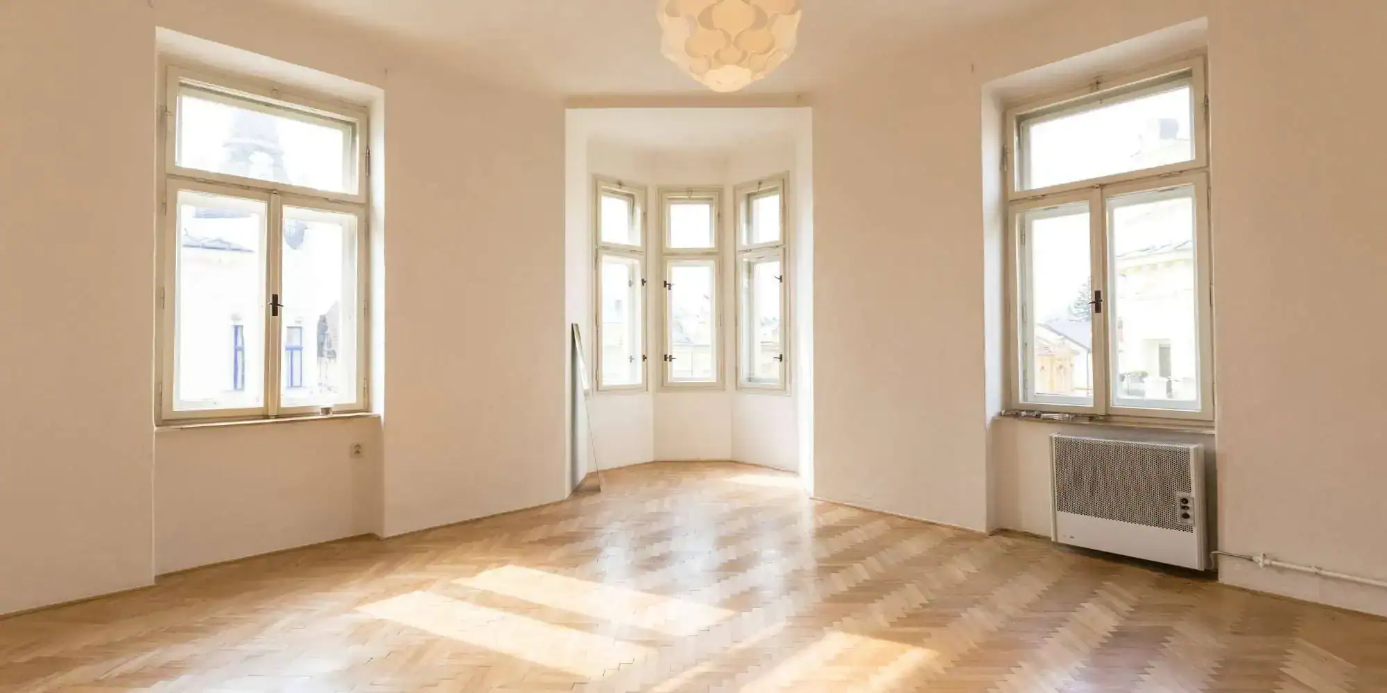
Paint stores use specific lighting designed to make colors look neutral and appealing. That’s not the lighting in your home.
The warm beige that looks perfect under those bright commercial lights might turn yellow or pink once it’s on your walls under your actual light bulbs and windows. Color behaves differently depending on the light source.
Natural light changes throughout the day—morning light is cooler and bluer, afternoon light is warmer and more golden, and evening light under lamps creates yet another shift. Artificial lighting adds another layer. Daylight bulbs make colors look blue. Warm white bulbs make colors look yellow. The same paint color will look like three different shades depending on when and how you’re looking at it.
This is why testing in your actual space matters more than anything else. Grab sample pots of your top three choices. Paint large squares on your wall—at least two feet by two feet, not tiny brush strokes.
Place them on different walls if possible, especially walls that get different types of light. Live with those samples for at least three days. Look at them in the morning when you’re making coffee. Check them in the afternoon when the sun is streaming through your windows. See how they look at night under your lamps.
You’ll notice that one of your choices probably looks great in the morning but turns muddy in the evening. Another might feel too bright during the day but perfect at night.
The right color is the one that works during the times you actually use that room. If you’re mostly in your bedroom at night, evening lighting matters more than morning light. If your kitchen gets used all day, you need a color that adapts to changing light without looking completely different from hour to hour.
Pay attention to which walls get direct sunlight and which stay in shadow. North-facing rooms receive cooler, more indirect light that can make colors feel flat or gray. South-facing rooms get warm, direct light that intensifies colors.
East-facing rooms are bright in the morning and dim in the afternoon. West-facing rooms do the opposite. The same beige will look like four different colors depending on which wall it’s on.
This matters especially in Macomb County, MI and Oakland County, MI, where Michigan’s changing seasons affect how much natural light your rooms receive throughout the year.
Undertones are the reason your “gray” paint turned purple or your “white” walls look dingy yellow. Every paint color has an undertone—a subtle hint of another color mixed in that you don’t notice on a tiny paint chip but becomes obvious once it’s covering your entire wall.
Grays are notorious for this. A gray can have blue undertones, purple undertones, green undertones, or brown undertones.
Under certain lighting, those undertones come forward and suddenly your neutral gray reads as lavender or sage. Whites are just as tricky. Some whites have warm yellow or peachy undertones. Others have cool blue or gray undertones. Put a warm white next to bright white trim and the warm white suddenly looks cream or beige.
Here’s how to identify undertones before you commit. Look at the darkest color on the paint strip—the bottom shade that’s several steps darker than the color you’re considering.
That darkest shade reveals the true undertone. If the darkest color on your gray strip is purple, your lighter gray has purple undertones. If the darkest color on your white strip is yellow, your white has warm undertones.
Compare your paint sample to something pure white—a piece of printer paper works. Hold the paper next to your sample. If your “white” paint looks yellow or cream next to the paper, it has warm undertones.
If it looks blue or gray, it has cool undertones. This same trick works for any color. Compare it to something you know is neutral to see which direction it leans.
Undertones need to match the undertones in your existing finishes. If your hardwood floors have warm orange or red tones, choose paint colors with warm undertones.
If your tile has cool gray tones, choose paint colors with cool undertones. When undertones clash, the whole room feels off even if you can’t pinpoint exactly why.
Lighting affects how undertones appear. Warm lighting brings out warm undertones and can make cool colors look muddy. Cool lighting brings out cool undertones and can make warm colors look flat.
This is why the same paint color looks completely different in a north-facing room versus a south-facing room. The light in each space is pulling different undertones forward.
If you’re working with an open floor plan where multiple rooms flow together, your undertones need to be consistent across the whole space. You can use different colors, but they should all lean warm or all lean cool.
Mixing warm and cool undertones in connected spaces creates visual choppiness that makes your home feel disconnected. We understand these principles and can guide you through the selection process.
Want live answers?
Connect with a Legends Painting expert for fast, friendly support.
Designers don’t pick colors room by room. They create a palette for the entire home first, then apply different colors from that palette to different spaces. This creates flow and cohesion without making every room identical.
Start with three to four colors maximum for your main living areas. One dominant neutral anchors the space—this is usually the color you’ll use most. Then choose one or two accent colors that appear in different concentrations throughout your home.
This limited palette gives you enough variety to define different areas while maintaining visual connection. Your palette should include colors from the same family or colors with the same undertones. If your dominant neutral is a warm greige, your accent colors should also have warm undertones. This doesn’t mean everything needs to be beige—you can include warm greens, warm blues, or warm terracottas. The key is that they all lean the same direction temperature-wise.

Designers use a trick called the “crucial element” method. Find one item in your home that you absolutely love and aren’t planning to change—a rug, a piece of art, a throw pillow, a tile backsplash. This item becomes your color guide for the entire room or even your whole home.
Look at the colors in that inspiration piece. Someone—an artist, a designer, a textile creator—already did the hard work of choosing colors that work beautifully together.
You’re not copying their palette exactly, but you’re using it as a reference point. If your inspiration rug has sage green, warm cream, and terracotta, those are your color families. Your wall color should be one of those shades or a neutral that complements all three.
This approach removes the emotional overwhelm of staring at thousands of random paint chips. You’re not starting from scratch.
You’re working with a proven color combination that already exists in an item you love. Pull out the neutrals from your inspiration piece if you want subtle walls. Pull out the bolder colors if you want more personality. Either way, you know these colors work together because you’re literally looking at them working together.
Take your inspiration piece to the paint store. Most paint stores can color-match directly from fabric, tile, or photos.
They’ll scan your item and show you paint colors that match. You’ll usually get several options at different intensities—lighter versions, darker versions, and exact matches. This gives you a starting point that’s already tied to something in your home instead of something random off a wall display.
The crucial element method also helps with decision fatigue. Instead of evaluating every color on its own merits, you’re asking a simpler question: does this color appear in my inspiration piece, or does it complement the colors that do?
This narrows your options from thousands to maybe a dozen, which is a manageable number to test and compare.
If you’re working with multiple rooms, you can use different colors from the same inspiration piece in different spaces. Maybe the sage green goes in your bedroom, the warm cream goes in your living room, and the terracotta becomes an accent wall in your dining room.
Because all these colors came from the same source, they’ll naturally flow together when you move from room to room. This is one of the best interior painting tips we recommend to homeowners in Oakland County, MI and beyond.
Finish affects how your color looks just as much as the color itself. The same paint in flat finish versus satin finish will appear as two different shades. Finish also determines how durable your paint is and how easy it is to clean, which matters depending on how you use each room.
Flat or matte finish has no shine. It absorbs light instead of reflecting it, which makes colors look richer and hides wall imperfections.
The downside is that flat paint is harder to clean. Scuffs and marks don’t wipe off easily, and scrubbing can remove the paint. Flat works well for low-traffic areas like formal living rooms, dining rooms, or adult bedrooms where walls don’t get touched often.
Eggshell finish has a slight sheen—just enough to give the color some depth without looking shiny. It’s more durable than flat and handles gentle cleaning with a damp cloth.
Eggshell has become the most popular finish for main living areas because it balances appearance with practicality. It works in family rooms, bedrooms, hallways, and any space that gets moderate use.
The subtle reflection catches light throughout the day, so your wall color shifts slightly as natural light changes, adding visual interest without being dramatic.
Satin finish has noticeable sheen and significantly more durability. It’s the go-to choice for high-traffic areas, kitchens, bathrooms, and any space that needs frequent cleaning.
Satin handles scrubbing without losing its finish, and most marks wipe off easily. The higher sheen does mean it highlights wall imperfections more than flatter finishes, so your walls need to be in decent condition. Satin also makes colors appear slightly lighter and brighter than they look in eggshell or flat.
Semi-gloss and high-gloss finishes are very shiny and extremely durable. These are typically used on trim, doors, cabinets, and other surfaces that get heavy use or need to withstand moisture.
Most people don’t use glossy finishes on walls because the shine is too reflective and shows every imperfection. But for woodwork and architectural details, the durability and easy cleaning make glossy finishes worth the extra sheen.
Finish choice also depends on your home’s condition. If your walls have texture, patches, or imperfections you’re not planning to fix, stick with flat or eggshell.
These finishes hide flaws. If your walls are smooth and well-maintained, you have more flexibility. Satin will look fine and give you easier maintenance. If you’re painting new drywall or freshly repaired walls, any finish will work—choose based on the room’s function and how much cleaning you anticipate.
Michigan’s climate adds another consideration. Homes in Macomb County, MI deal with humidity changes from season to season.
Bathrooms, kitchens, and laundry rooms need moisture-resistant finishes. Satin or semi-gloss handles humidity better than flat. For exterior-adjacent spaces like mudrooms or three-season porches, durability matters more than appearance. Choose a finish that can handle temperature fluctuations and higher moisture levels without peeling or developing mildew.
Choosing interior paint colors stops feeling overwhelming once you have a process. Start with what’s already in your home—your floors, your countertops, your favorite rug or piece of art. Let those existing elements guide your color direction instead of fighting against them.
Test your top choices in your actual space, in your actual lighting, for at least a few days. Pay attention to undertones and how they interact with your fixed finishes. Create a simple whole-home palette instead of picking random colors room by room.
Limit yourself to three or four colors that all share the same undertone temperature. Use different intensities of those colors in different spaces to create variety while maintaining flow. Choose your finish based on how you actually use each room—flat for low-traffic formal spaces, eggshell for main living areas, satin for kitchens and bathrooms.
When you’re ready to move forward with your residential painting project in Macomb County, MI or Oakland County, MI, we bring over a decade of painting experience to every project. At Legends Painting LLC, we focus on quality workmanship and competitive pricing that makes professional results accessible.
Article details:
Continue learning: