Summary:
This year’s paint trends aren’t just about following what’s popular on social media. They’re responding to something deeper—the way Michigan homeowners actually live.
Our long winters and bright summers create unique lighting challenges that most paint trends ignore. You need colors that look inviting during those gray February afternoons and still feel fresh when summer light floods your living room.
The 2025 palette solves this with what designers call “quietly colorful hues”—colors with enough depth to create warmth in low light, but enough subtlety to avoid overwhelming your space when the sun comes out.
Benjamin Moore named Cinnamon Slate their Color of the Year for good reason. This isn’t your typical brown or your standard purple—it’s something entirely different.
Picture the color of a smooth river stone after rain, with hints of plum and chocolate woven together. It’s sophisticated enough for your dining room, cozy enough for a bedroom, and neutral enough to work with furniture you already own.
What makes Cinnamon Slate perfect for Michigan homes is how it responds to our changing light. In the morning, those plum undertones catch the soft light and create a gentle, welcoming feel. By afternoon, the brown base grounds the space and makes it feel substantial and secure.
You can use it as a full room color or as an accent wall paired with crisp whites or warm creams. Either way, it creates that “expensive paint job” look without the expensive paint job price tag. It’s the kind of color that makes guests ask what paint you used—and makes you feel proud to tell them.
Terracotta, sage green, and warm taupe aren’t new colors, but the way designers are using them in 2025 feels completely fresh. These aren’t the muddy earth tones from decades past—they’re refined, sophisticated versions that work in contemporary homes.
Terracotta brings Mediterranean warmth without the vacation-rental vibe. Today’s terracotta has more pink and less orange, making it surprisingly versatile. Use it in a kitchen with white cabinets and brass hardware for an instantly updated look, or try it in a living room with cream furniture for something that feels both current and timeless.
Sage green continues to prove its staying power, but 2025’s version has more gray mixed in. This makes it less “nursery” and more “luxury spa.” It’s perfect for bedrooms where you want calm energy, or bathrooms where you’re creating a retreat-like atmosphere.
Warm taupe might sound boring, but the new versions have subtle pink or mushroom undertones that make them feel rich rather than bland. These colors work beautifully in open floor plans where you need something that flows from room to room without feeling repetitive.
The key with earth tones is layering different shades together. Paint your living room walls in warm taupe, add sage green throw pillows, and introduce terracotta through artwork or pottery. The result feels collected and intentional, not matchy-matchy.
Want live answers?
Connect with a Legends Painting expert for fast, friendly support.
The best paint colors don’t just look good—they change how a room feels and functions. That’s especially important in the spaces where your family spends the most time.
Your living room sets the tone for your entire home. The right paint color makes it feel like a place where people want to gather, not just pass through. Bedrooms need colors that help you unwind after long days. Kitchens benefit from colors that make cooking and eating feel more enjoyable.
2025’s trending colors excel at creating these emotional responses while still being practical enough for busy family life.
Your living room works harder than any other space in your home. It’s where you relax after work, where kids do homework, where you entertain friends, and where you binge-watch shows on Sunday afternoons. The paint color needs to handle all of that gracefully.
Rich, warm neutrals like mushroom brown or deep greige create the perfect backdrop for this kind of multi-purpose living. They’re sophisticated enough for adult conversation but cozy enough for family movie nights. These colors make your furniture look more expensive and your lighting more flattering.
If you’re ready for something bolder, consider a deep blue-green or forest green accent wall. These colors create a sense of drama and sophistication while still feeling livable. Pair them with warm wood tones and brass accents for a look that’s both current and classic.
The secret to living room paint colors is thinking about how the room looks at different times of day. Morning coffee, afternoon reading, evening entertaining—your paint should enhance all of these moments. Warm, complex colors with multiple undertones adapt to changing light better than flat, single-note colors.
Don’t forget about your trim and ceiling. Painting trim in a slightly lighter version of your wall color creates a cohesive, custom look. A ceiling painted in the palest version of your wall color makes the room feel taller and more finished.
Your bedroom should be your sanctuary, and the right paint color plays a huge role in making that happen. The trending colors for 2025 understand that bedrooms need to be both calming and energizing—peaceful enough for sleep, but inspiring enough to start your day right.
Soft, muted versions of trending colors work beautifully in bedrooms. Think pale sage, dusty terracotta, or the gentlest version of warm taupe. These colors create a cocoon-like feeling without making the room feel dark or cave-like.
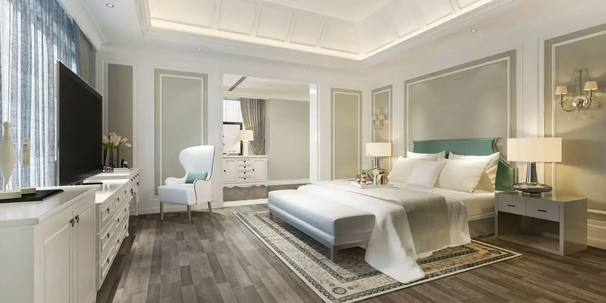
For master bedrooms, consider deeper, more sophisticated versions of these same colors. A rich, warm gray with purple undertones creates an elegant, hotel-like atmosphere. Deep sage green feels both restful and luxurious, especially when paired with white bedding and natural wood furniture.
The key is choosing colors that look good in both natural and artificial light. Michigan bedrooms often rely on lamps and overhead lighting, especially during winter months. Colors with warm undertones prevent your bedroom from feeling cold or clinical under artificial light.
If you’re hesitant about color in the bedroom, start with an accent wall behind your headboard. This gives you the visual interest and warmth of color without overwhelming the space. You can always expand to additional walls later if you love the result.
Consider the colors you see first thing in the morning and last thing at night. They should make you feel calm and content, not stressed or overstimulated. The trending earth tones and warm neutrals excel at creating this kind of emotional response.
The best paint color trend is the one that makes you happy to walk into your home every single day. These 2025 colors offer proven combinations that work in real homes with real families, not just magazine photo shoots.
Whether you choose Benjamin Moore’s sophisticated Cinnamon Slate, embrace the warmth of terracotta and sage, or create your own combination of trending earth tones, you’re investing in a home that feels intentionally designed and genuinely welcoming.
The key is working with painters who understand how these colors behave in Michigan homes, who know which finishes work best in our climate, and who can help you achieve the exact look you’re envisioning. When you’re ready to transform your space with 2025’s most beautiful interior paint trends, we at Legends Painting LLC have the experience and expertise to bring your vision to life.
Article details:
Continue learning: