Summary:
Here’s what most people don’t realize: the colors surrounding you every single day are either working for you or against you. They’re affecting your mood, your energy, your sleep quality, and even what buyers will offer if you ever decide to sell. In Michigan, where we spend so much time indoors during those long winter months, your interior paint colors matter even more.
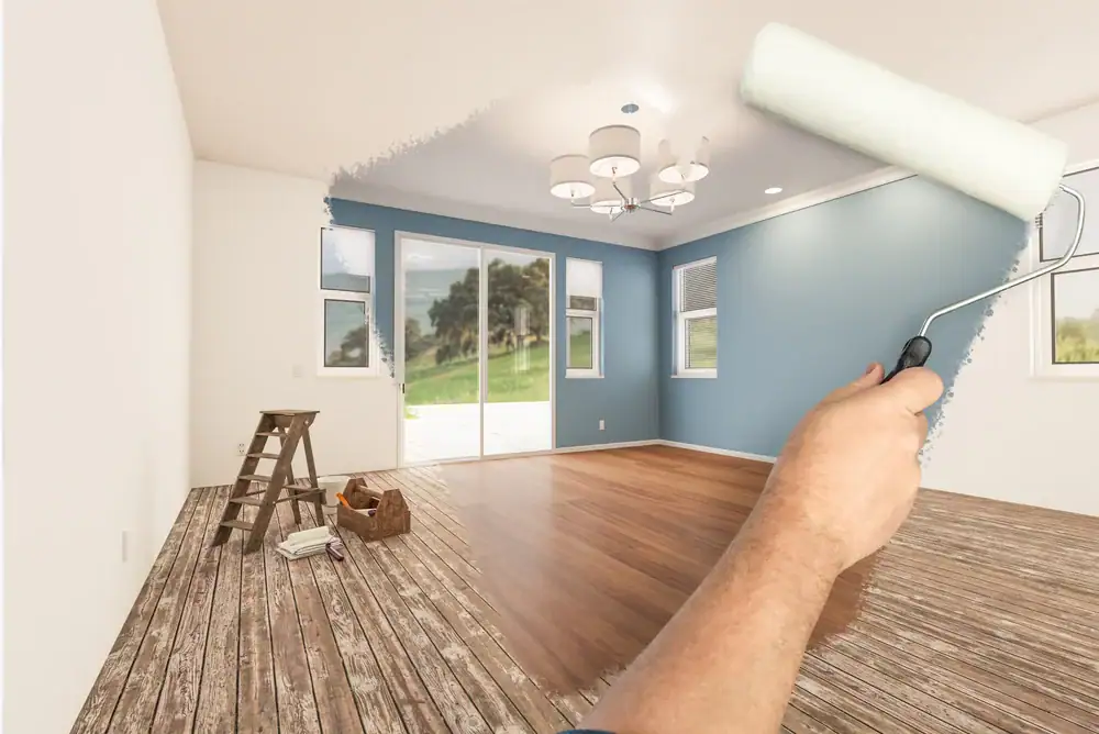
The residential interior painting trends for 2026 aren’t asking you to take huge risks or follow whatever’s trending on social media. They’re responding to something deeper—how people actually want to feel in their homes. Let’s talk about colors that work with Michigan’s unique light, boost your mood when you need it most, and add real value to your property.
Paint trends come and go, but 2026’s palette is different. These aren’t just colors that look good in magazine spreads shot in California sunshine. They’re colors that solve real problems for Michigan homeowners.
Our winters are long. Our natural light changes dramatically between December and July. And our homes need to feel warm and inviting when it’s gray outside for weeks at a time, but still feel fresh when summer light floods through the windows.
The colors dominating 2026 are what designers call “quietly colorful hues.” They have enough depth to create warmth in low light, but enough subtlety to avoid overwhelming your space when the sun comes out. Think nature-inspired greens, warm earth tones, and neutrals with actual personality—not the stark whites and cool grays that have been everywhere for the past decade.
Biophilic interior design isn’t just a fancy term. It’s the practice of bringing nature’s colors indoors, and it’s backed by real science. Studies show that nature-inspired paint colors can reduce stress levels by up to 60 percent, enhance cognitive function, and even support better sleep patterns.
The palette draws from what you see outside your window: the subtle greens of leaves, the shifting blues of the sky, earthy browns of bark, and the muted grays of river stones. These aren’t the bright, primary colors you remember from grade school. They’re sophisticated, muted versions that work in contemporary homes.
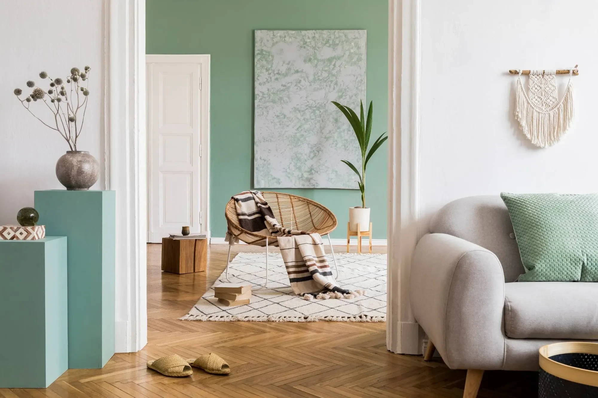
Sage green is leading the pack for 2026. It brings a calming presence to bedrooms and living rooms without feeling cold or sterile like some of those trendy grays. The beauty of sage is how it shifts throughout the day—softer in morning light, richer as afternoon sun streams in. It pairs beautifully with warm wood tones, which is perfect if you’ve got oak floors or walnut furniture in your Michigan home.
Olive adds warmth without feeling too earthy or dated. Eucalyptus sits somewhere between green and gray, giving you color without committing to anything too bold. These greens work especially well in Michigan because they echo the landscapes outside our windows, creating that seamless indoor-outdoor connection even when it’s too cold to actually go outside.
Earth tones are having their moment too, but these aren’t the muddy browns from decades past. Think terracotta that brings Mediterranean warmth, warm taupe that feels both modern and timeless, and clay-inspired pinks that add softness without feeling juvenile. These colors ground your space and create that cozy, lived-in feeling that makes a house actually feel like home.
The reason biophilic colors work so well in Michigan specifically is how they respond to our changing light. In winter, when natural light is limited and often gray, these nature-inspired hues maintain their warmth and don’t feel flat or depressing. In summer, they stay fresh and inviting without becoming overwhelming. That versatility is exactly what you need when your home’s lighting conditions change so dramatically throughout the year.
Color psychology isn’t just marketing fluff. Your brain processes colors in the limbic system—the same area responsible for emotions and memory. Different colors trigger specific physiological and emotional responses that affect how you feel, think, and behave in a space.
Blue is naturally calming. It can actually lower your blood pressure and heart rate, which is why it works so well in bedrooms and bathrooms. Light blues like soft sky or powder blue create a peaceful, spa-like environment that helps you decompress. Deeper blues like navy or indigo evoke security and stability. But here’s the catch: in Michigan’s gray winter light, some blues can feel cold or depressing. The trick is choosing blues with slight warm undertones or pairing them with warm wood tones and textiles.
Green promotes relaxation and emotional balance by mimicking the rejuvenating qualities of nature. Light greens work well in living rooms and home offices because they create a sense of calm focus without making you sleepy. Darker greens make wonderfully rich accent colors that add depth without overwhelming a space. The reason green works so well for mood-boosting is that it’s abundant in nature—your brain recognizes it as familiar and safe.
Yellow reflects light and creates an uplifting, cheerful mood. It’s associated with intellect and creativity, which is why it works in kitchens and home offices. But too much bright yellow can actually increase feelings of agitation or anxiety. The key is using it strategically—maybe in a hallway that needs brightening, or as an accent in a kitchen. Softer yellows like butter or cream bring warmth without the intensity.
Earth tones—warm browns, terracotta, clay, taupe—ground us and offer stability. They create that sense of comfort and security that makes you actually want to spend time in a room. These colors work particularly well in Michigan homes because they add warmth during our long winters without feeling heavy or dark. They’re also incredibly versatile, pairing well with almost any accent color or decor style.
What’s important to understand is that these psychological effects are real and measurable. Research shows that people in certain colored rooms eat faster, make quicker decisions, and experience heightened emotional responses. When you’re choosing colors for your home, you’re not just deciding what looks nice—you’re shaping how you’ll feel in those spaces every single day.
For Michigan homeowners specifically, mood-boosting colors become even more critical during winter months when seasonal affective disorder is common and we’re spending most of our time indoors. The right paint colors can make the difference between a home that feels like a refuge and one that contributes to that cabin fever feeling we all know too well.
Want live answers?
Connect with a Legends Painting expert for fast, friendly support.
Paint is one of the most cost-effective ways to increase your home’s value, but not all colors deliver the same return. Interior painting offers about a 107 percent return on investment on average, but strategic color choices can add thousands more to your selling price.
Here’s what the data actually shows: homes needing paint sell for 7 to 10 percent less than identical, freshly painted homes. That’s a significant hit if you’re planning to sell. But it’s not just about having fresh paint—it’s about having the right colors.
Neutral doesn’t mean boring. It means timeless, versatile, and appealing to the broadest range of buyers. Light greens to khaki tones in bedrooms can boost selling prices by an average of $1,332. Gray-blue kitchens add about $1,800. Neutral living rooms in dove gray or similar tones add around $1,104. These aren’t huge numbers individually, but they add up quickly when you’re painting multiple rooms.
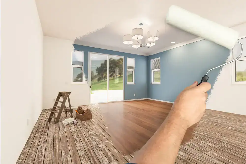
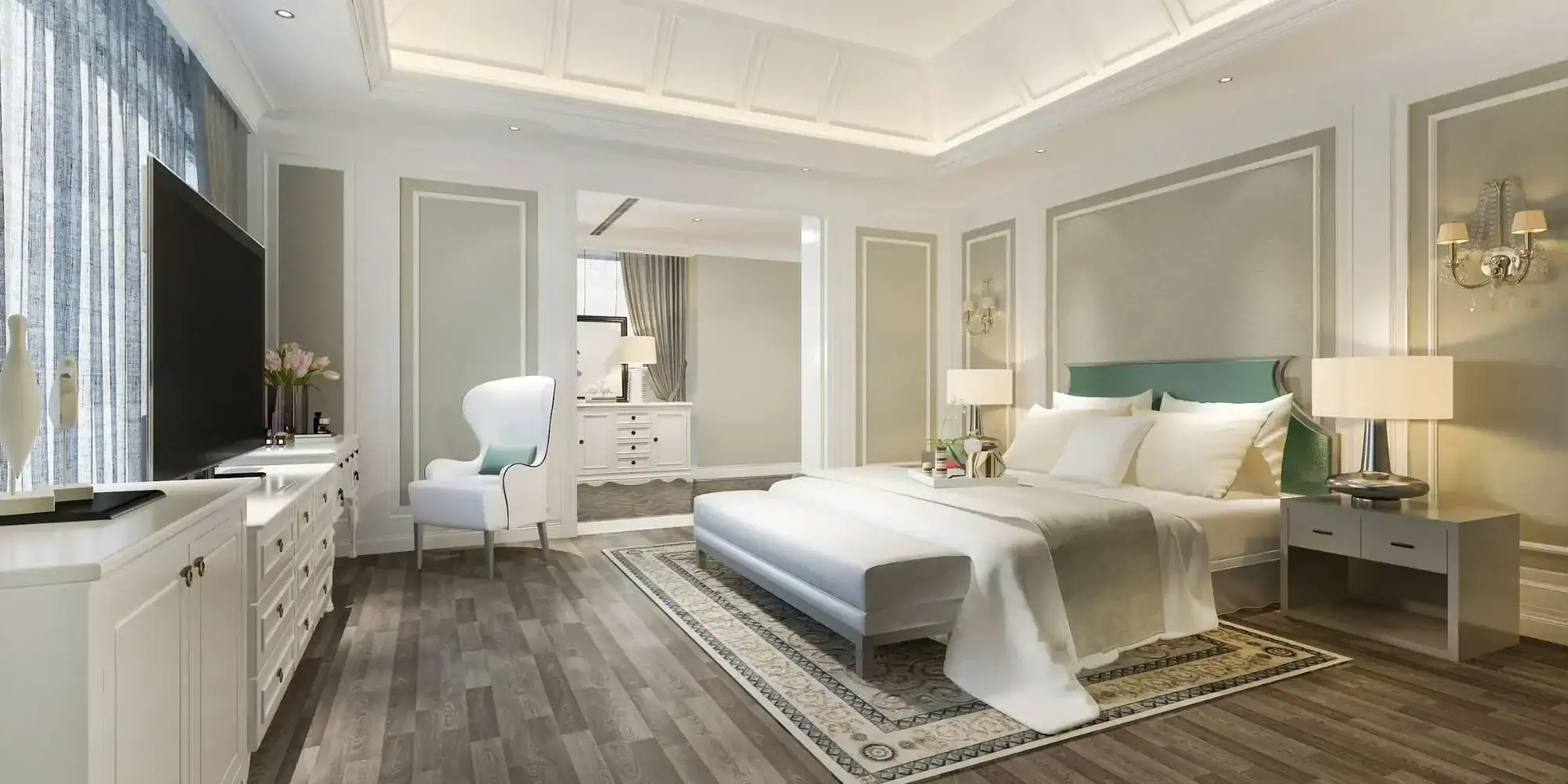
Bedrooms need colors that promote calm and rest. Light green to khaki tones work beautifully because they’re soothing without being cold. Soft blues create that peaceful, spa-like environment. Warm neutrals like greige or soft beige make the space feel cozy and inviting. The key is choosing colors you see first thing in the morning and last thing at night—they should make you feel content, not stressed.
In Michigan bedrooms specifically, consider colors with warm undertones. Our bedrooms often rely heavily on artificial lighting, especially during winter months when you’re getting ready in the dark and coming home after sunset. Colors with warm undertones prevent your bedroom from feeling cold or clinical under lamp light.
Living rooms benefit from versatile neutrals that photograph well and appeal to different tastes. Dove gray, warm taupe, and soft greige create clean canvases that make furniture pop and allow for easy decorating changes. If you want more personality, consider an accent wall in sage green or a muted terracotta that adds warmth without alienating potential buyers.
Kitchens painted in light blues or gray-blues consistently sell for more than kitchens in other colors. The once-popular yellow or beige kitchens are out. Buyers want fresh, clean-feeling spaces that feel modern without being trendy. Soft whites and creamy tones also work well, reflecting light and making even small kitchens feel larger.
Bathrooms don’t have a huge impact on selling price based on color alone, but tans, oatmeal, and beige tones perform slightly better than other options. The key in bathrooms is choosing colors that work with moisture—semi-gloss or glossy finishes in colors that resist mold and mildew.
The mistake many homeowners make is going too bold everywhere. Deep or unusual colors can be stunning in the right context, but if they dominate a space, they overwhelm potential buyers and make it harder for them to picture their own belongings in your home. Use bold colors as accents instead of full-room coverage. One accent wall is often all you need to add personality without limiting your buyer pool.
Certain colors consistently perform poorly when it comes to resale value. Bright yellow in living rooms or kitchens can reduce selling prices by nearly $4,000. Bright red in bedrooms or living rooms drops values by $1,800 to $2,000. These aren’t bad colors necessarily—they’re just very personal choices that don’t appeal to most buyers.
Dark browns in bathrooms, especially those Tuscan-style shades that were popular years ago, sell for an average of $469 less than other homes. Slate or dark gray dining rooms reduce values by over $1,000. The problem with these darker colors isn’t that they look bad—it’s that they make spaces feel smaller and require buyers to repaint before they can move in, which feels like immediate work.
Orange and terra-cotta in living rooms also tend to depress selling prices. While warm earth tones are trending for 2026, there’s a difference between sophisticated terracotta accents and bright orange walls. The key is subtlety and balance.
If you’re planning to sell within the next few years, stick to colors that have proven appeal: soft whites and creamy tones, warm neutrals like greige and taupe, light blues and soft grays, and nature-inspired greens in muted tones. These colors give you the personality and warmth you want while living in your home, but they won’t turn off buyers when it’s time to sell.
For Michigan homeowners, there’s an additional consideration: our real estate market is competitive, and first impressions matter. Fresh, modern paint colors signal that a home has been well-maintained. Outdated or overly bold colors signal that buyers will need to invest time and money before moving in. In a market where buyers have options, that perception can cost you thousands in offers.
The best color in the world won’t matter if your paint job fails in two years. Michigan’s climate is tough on interior paint—we’ve got humidity fluctuations between seasons, temperature swings, and homes that experience significant expansion and contraction throughout the year.
Proper surface preparation is what separates paint jobs that last 7 to 10 years from ones that need touch-ups or complete redoing within 2 to 3 years. That means sanding rough patches, filling nail holes, addressing hairline cracks, and applying primer that bonds chemically with your walls. It’s not the exciting part of painting, but it’s what makes everything else hold up.
Low-VOC or zero-VOC paints are becoming the standard, and for good reason. VOCs are volatile organic compounds—chemicals that evaporate into your indoor air and can cause headaches, dizziness, respiratory issues, and other health problems. The EPA states that indoor air can be up to ten times more polluted than outdoor air, and traditional paints are a major contributor.
Low-VOC paints contain less than 50 grams per liter of these compounds. Zero-VOC paints contain less than 5 grams per liter. They improve indoor air quality, reduce that harsh paint smell, and dry faster than traditional paints. They’re particularly important in bedrooms, spaces where children spend time, and for anyone with allergies or respiratory sensitivities. The trade-off is cost—these paints typically run 15 to 30 percent more than conventional options—but the health benefits and improved air quality justify the investment for most homeowners.
Choosing the right finish matters too. Eggshell works well for main living areas because it has a subtle luster that adds depth to colors and can be gently cleaned without leaving shiny spots. Satin is ideal for high-traffic areas and moisture-prone spaces like kitchens and bathrooms because it’s more durable and easier to scrub. Flat paint hides imperfections well but shows every fingerprint and can’t be cleaned effectively, so it’s best reserved for ceilings and low-traffic areas.
The colors you choose today should work with Michigan’s unique lighting throughout the year. Test your paint samples in different lighting conditions—morning, afternoon, evening, and under artificial light. Colors can look dramatically different depending on the light source. Live with those samples for a few days before making final decisions. What looks perfect in bright afternoon sun might feel completely different on a gray February morning.
If you’re ready to update your home with colors that actually work for how you live—colors that boost your mood during Michigan winters, hold up through our climate’s demands, and add real value to your property—we bring over 10 years of painting experience to Macomb and Oakland County homes. We focus on proper preparation, quality materials suited for Michigan’s climate, and the kind of attention to detail that makes paint jobs last.
Article details:
Continue learning: